

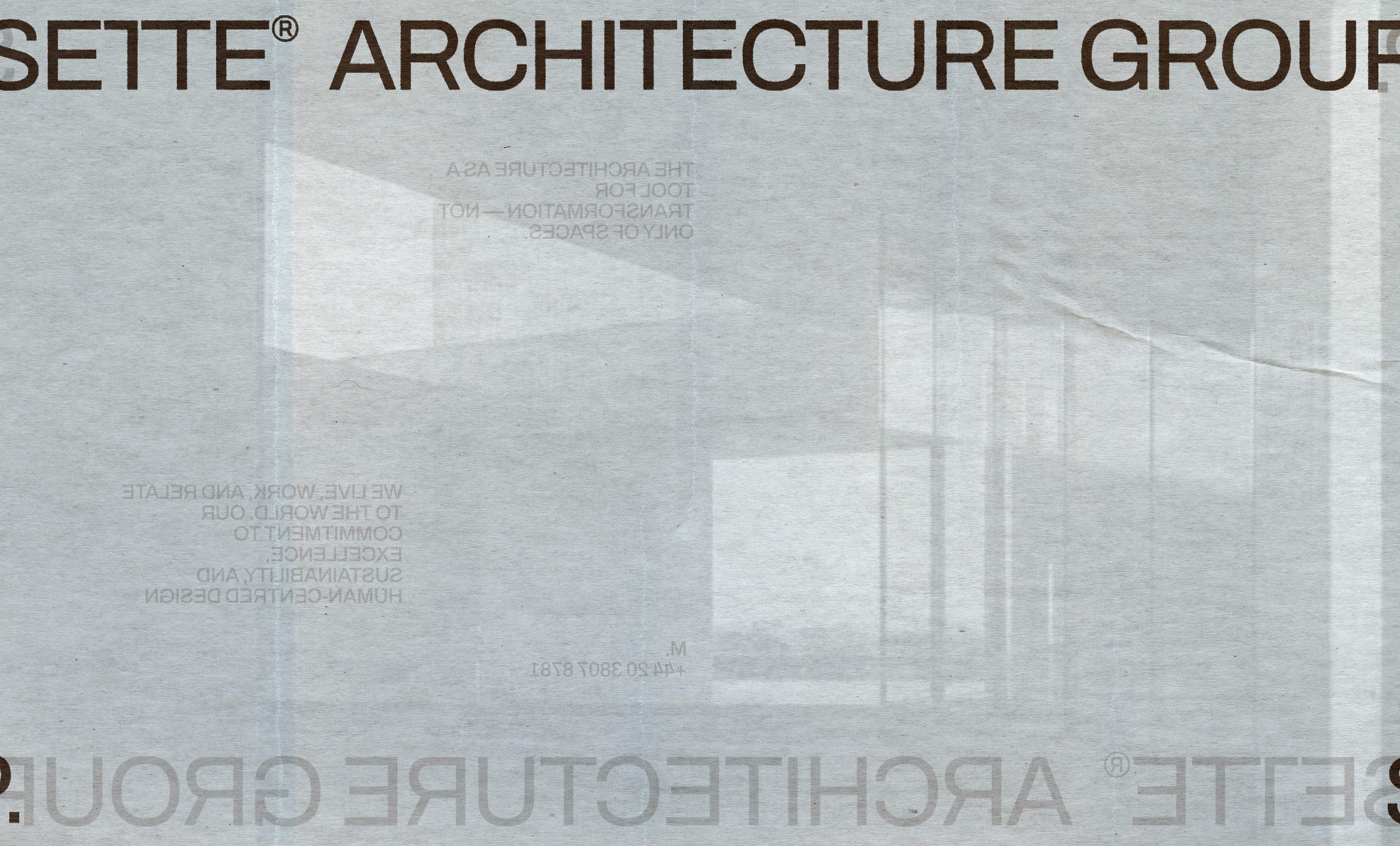

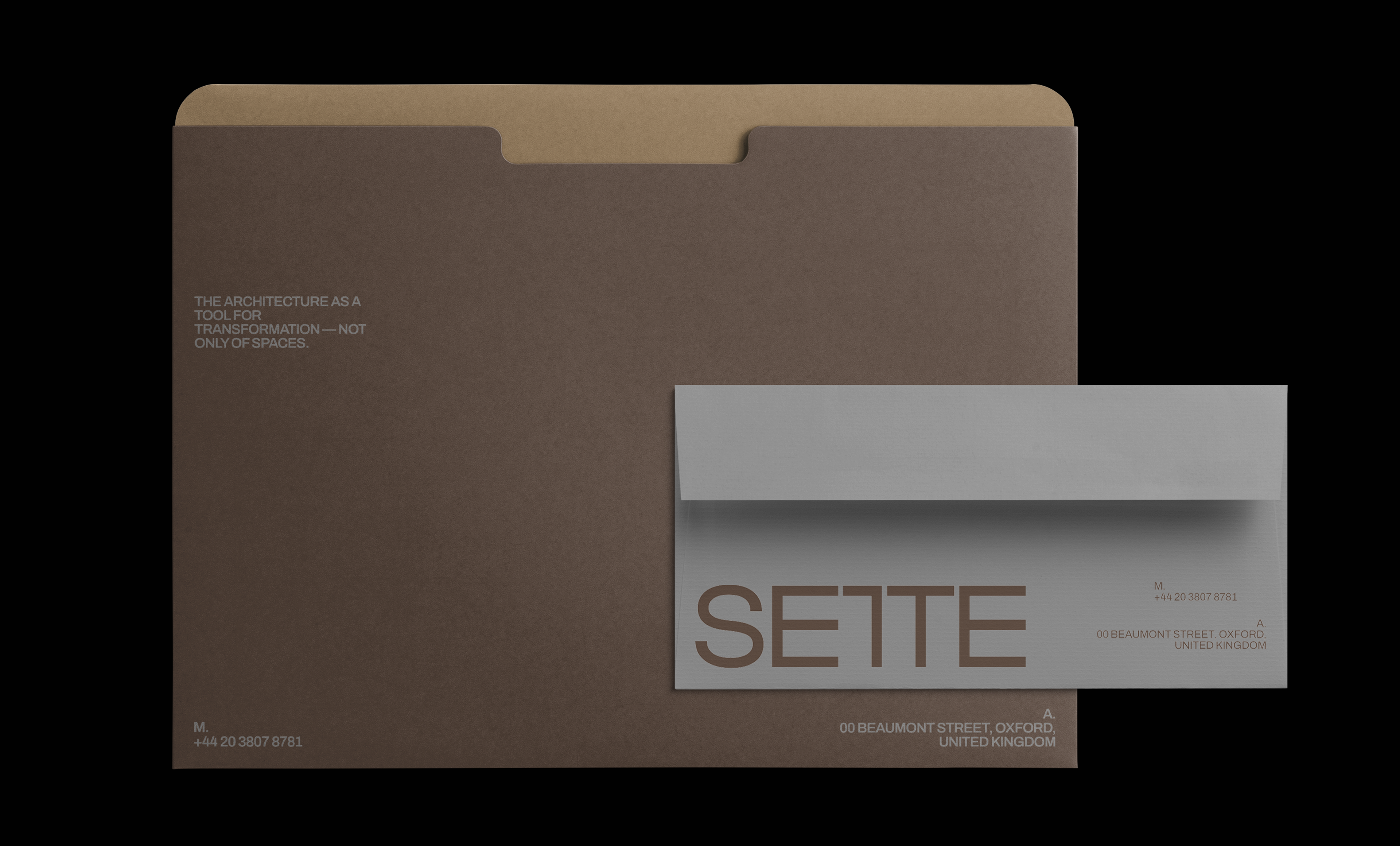

Sette Architecture Group
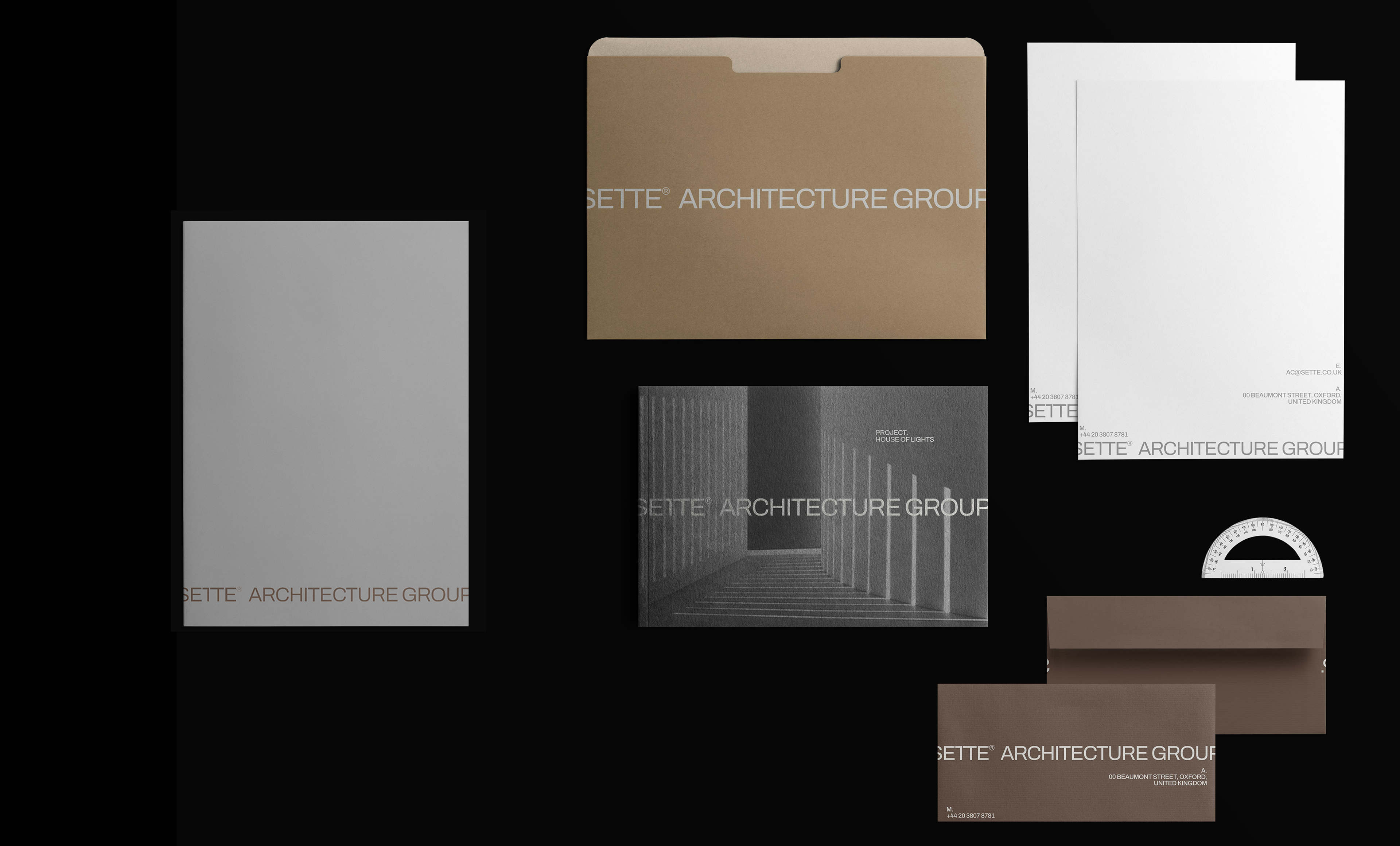
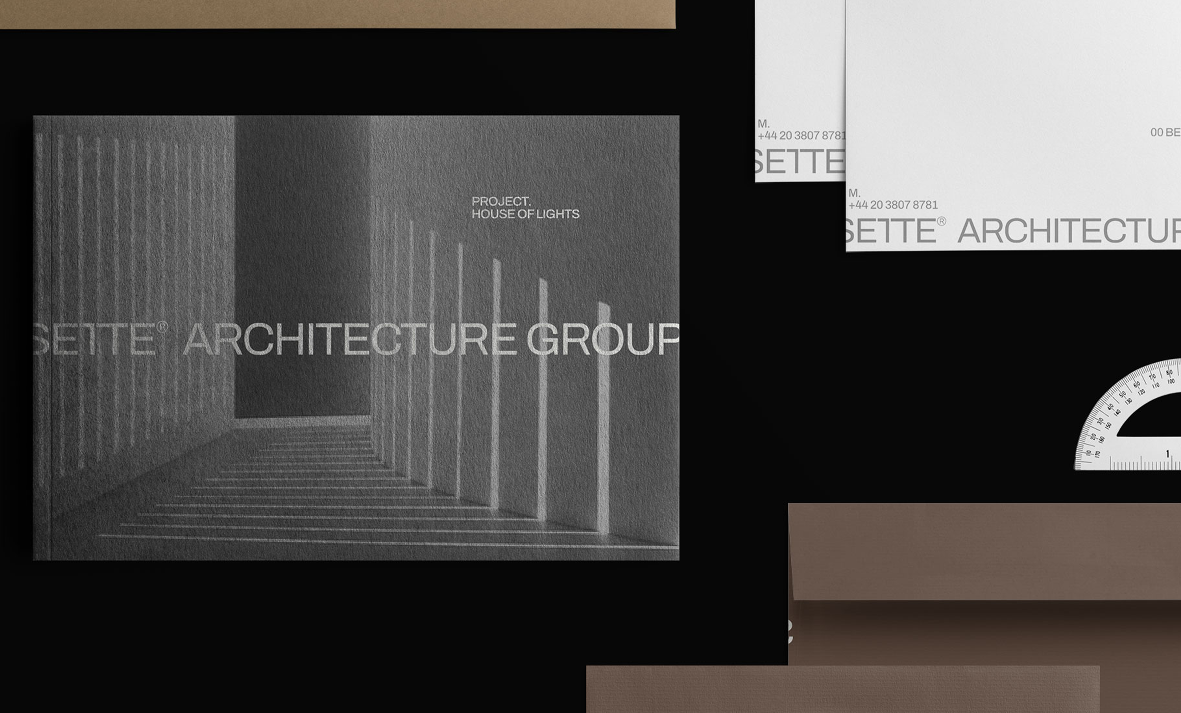
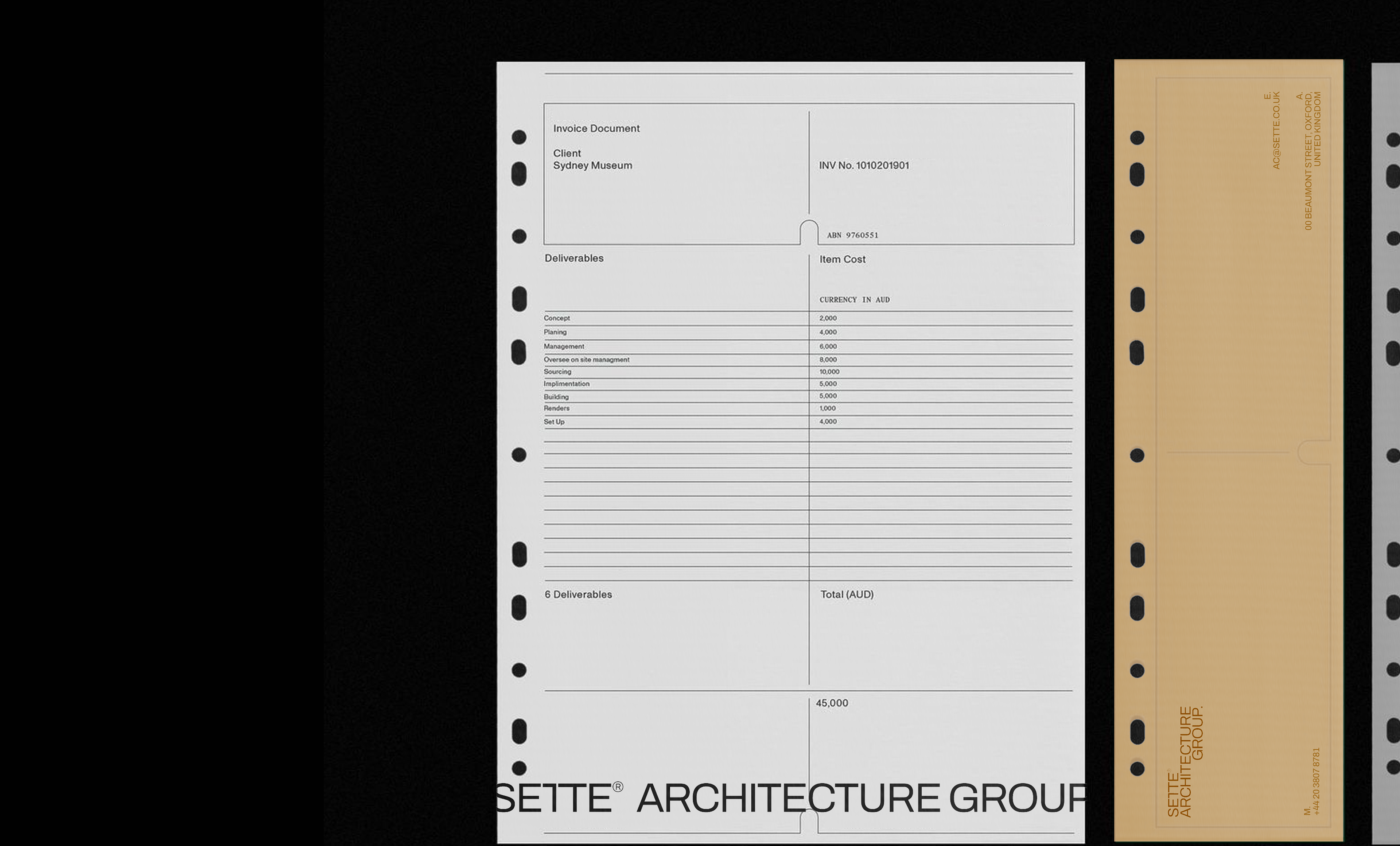
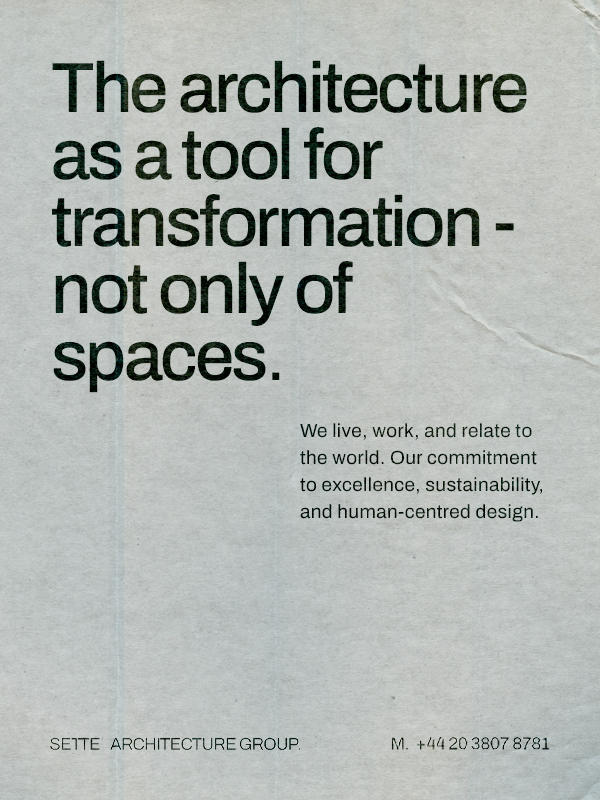
Sette Architecture Group is a celebrated architecture practice that strives to create buildings that are far from ordinary. Our challenge were engaged to rebuild their brand identity and website, as well as develop a suite of internal documentation to better reflect the sophisticated spaces they shape.
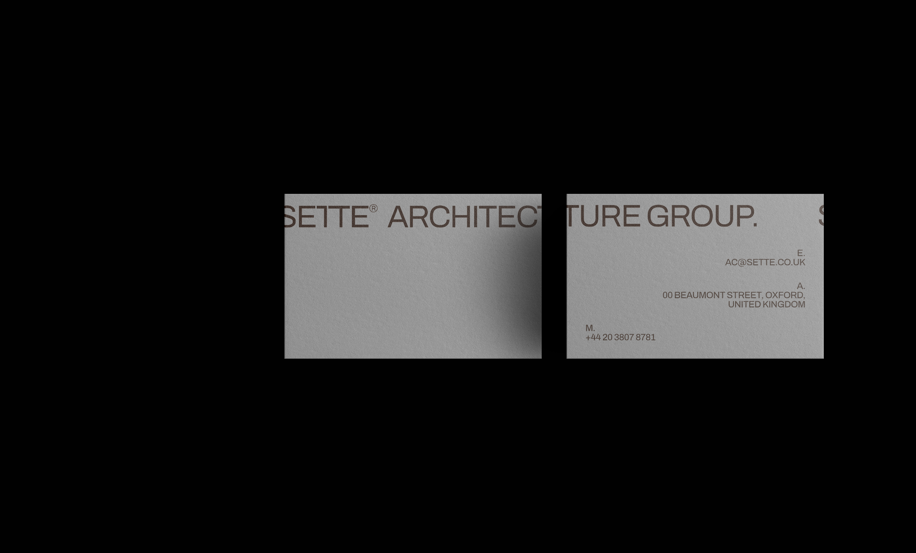
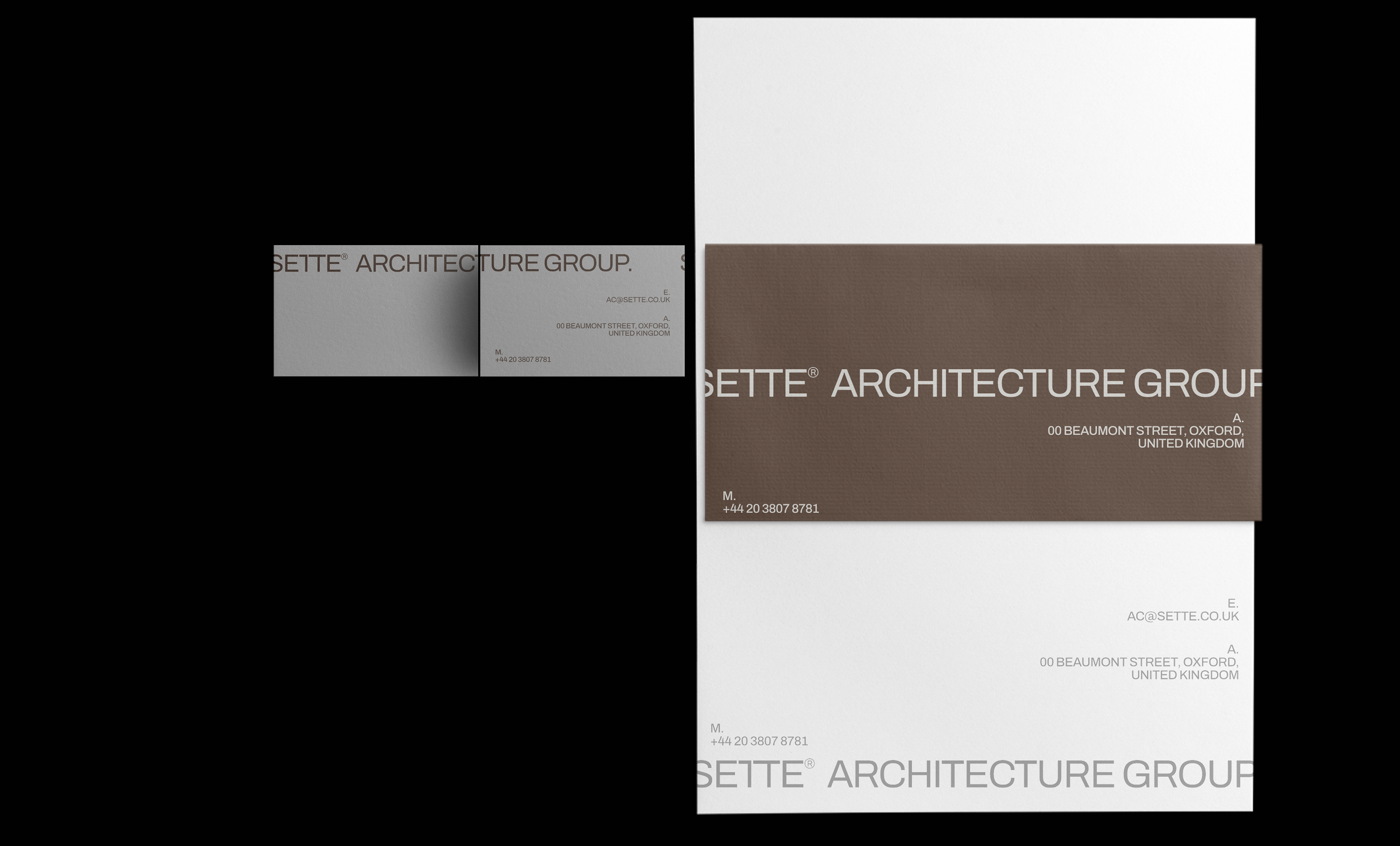
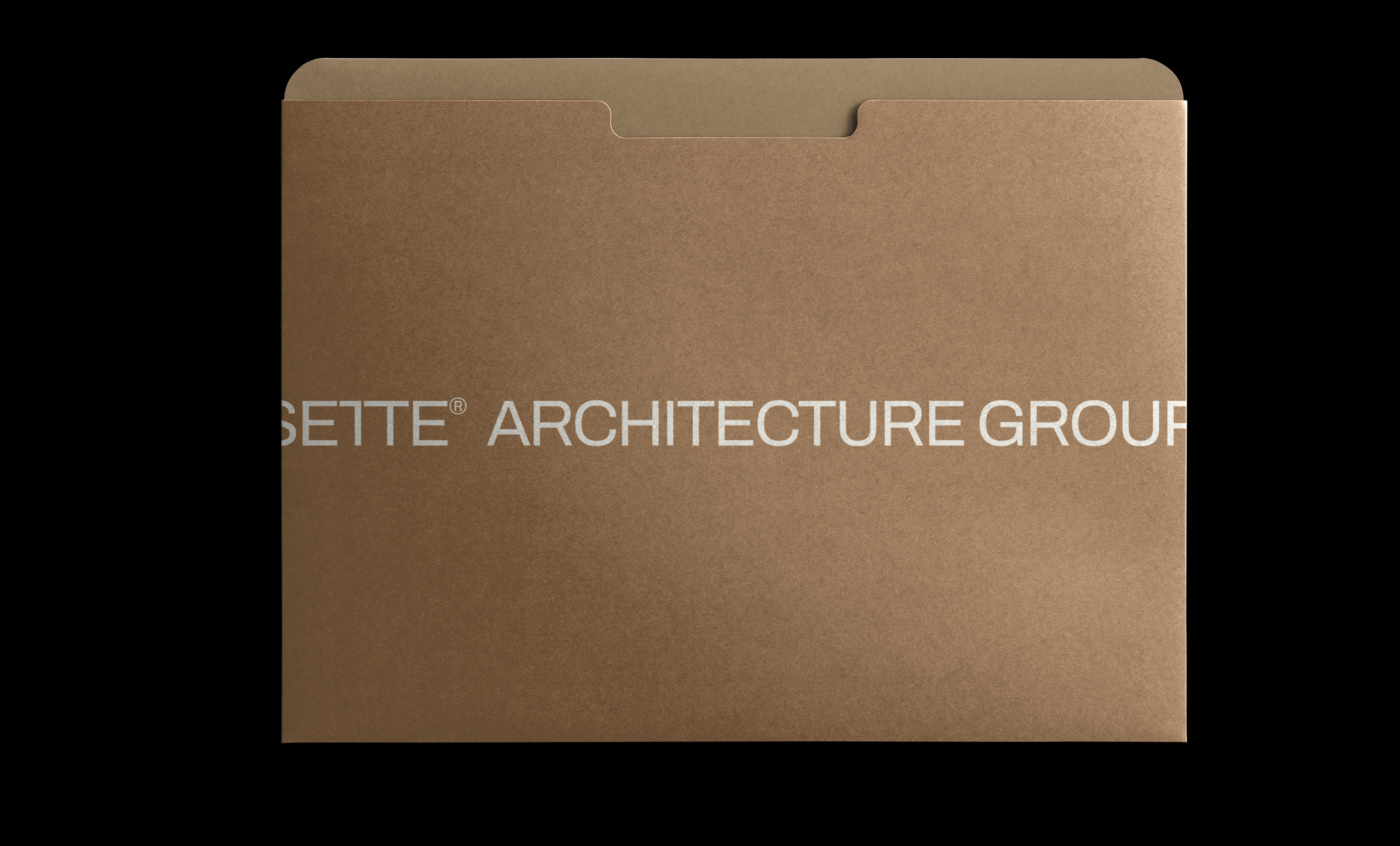
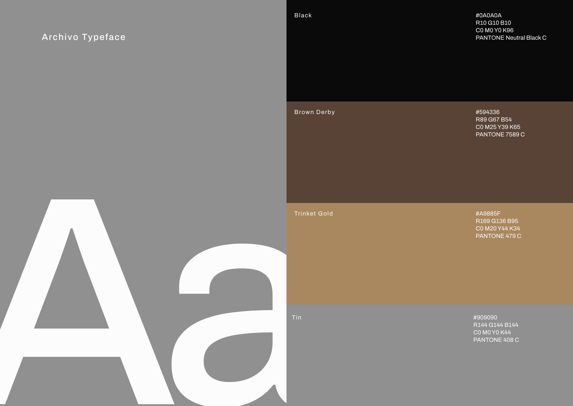
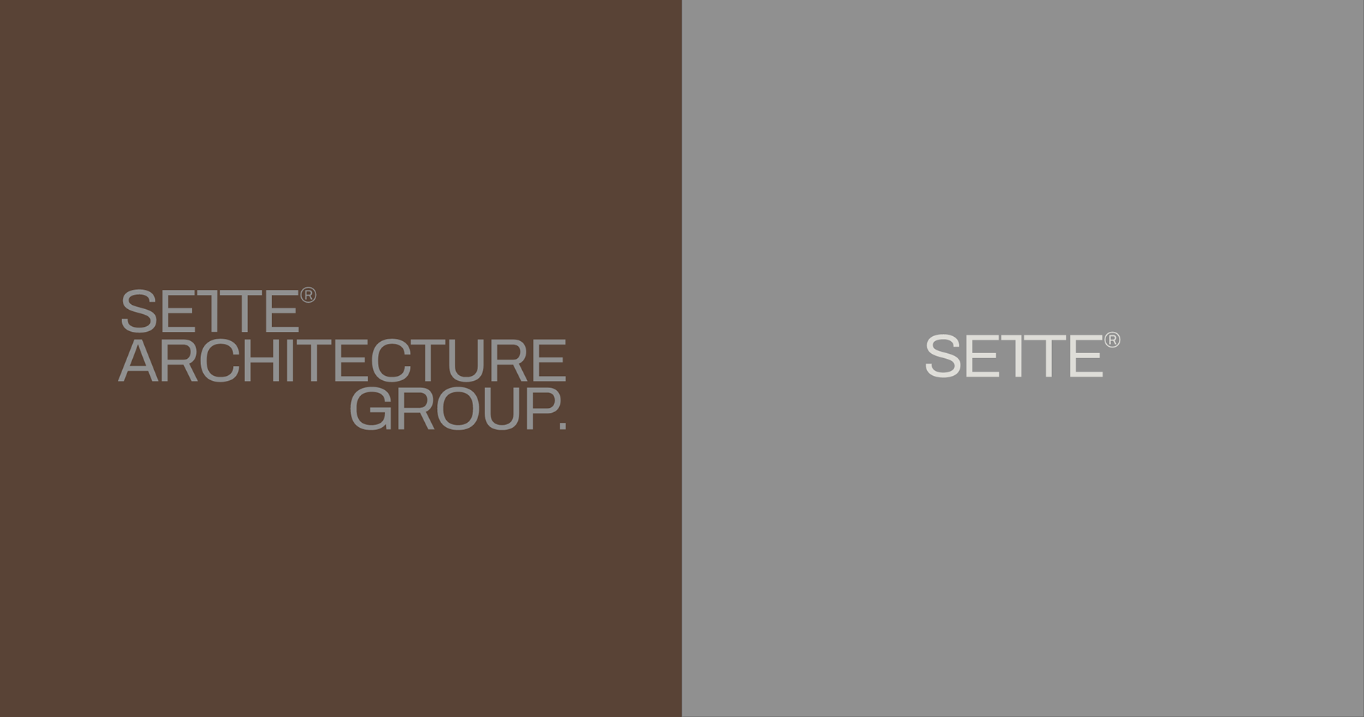
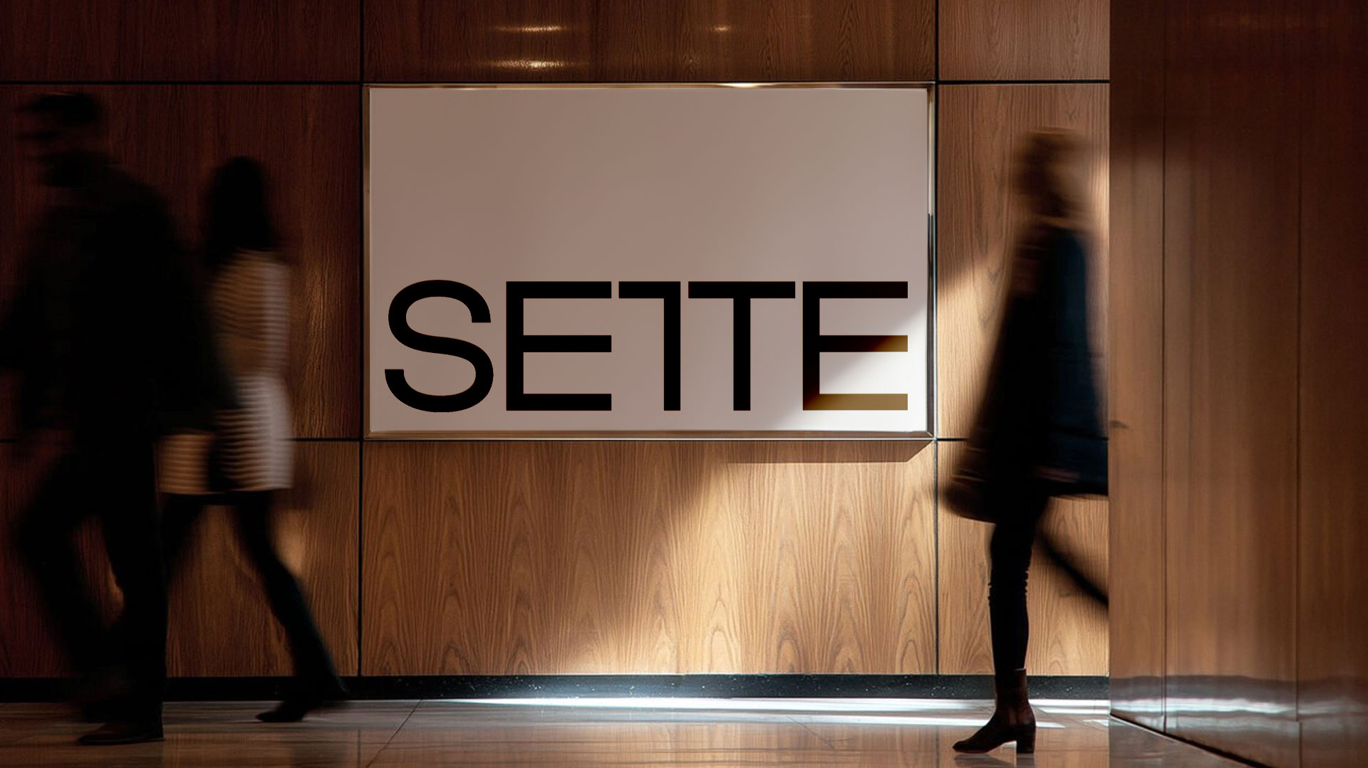
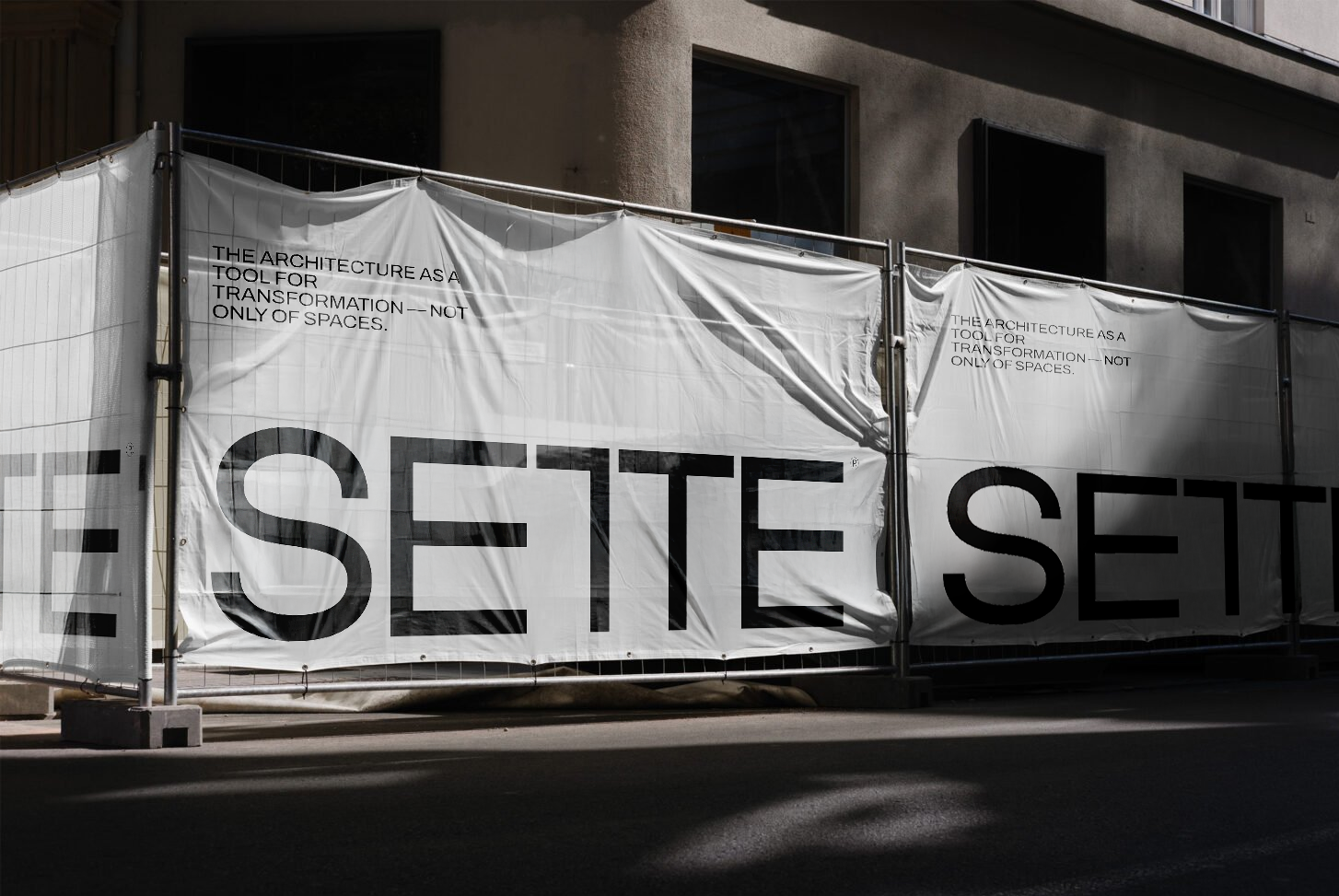
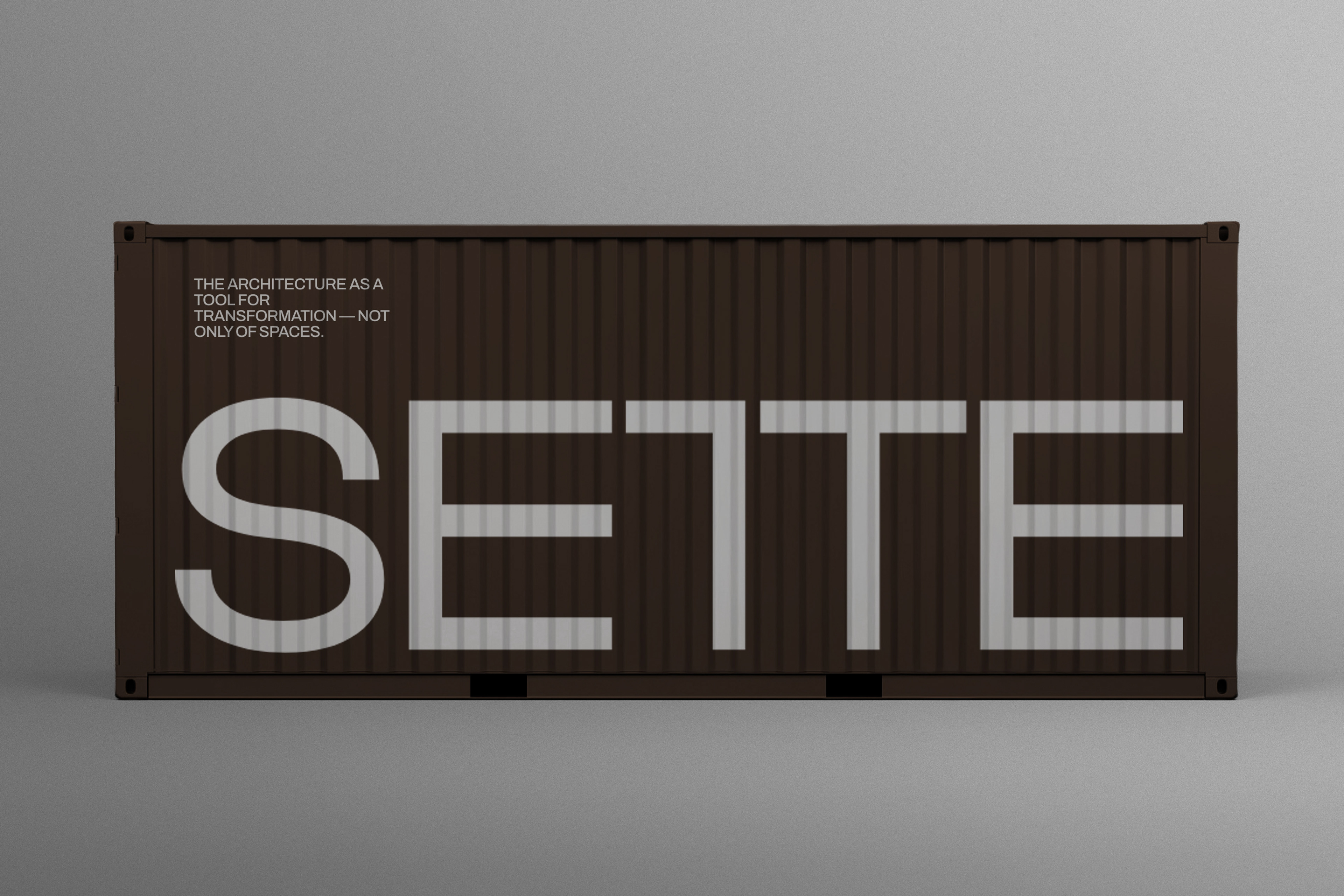
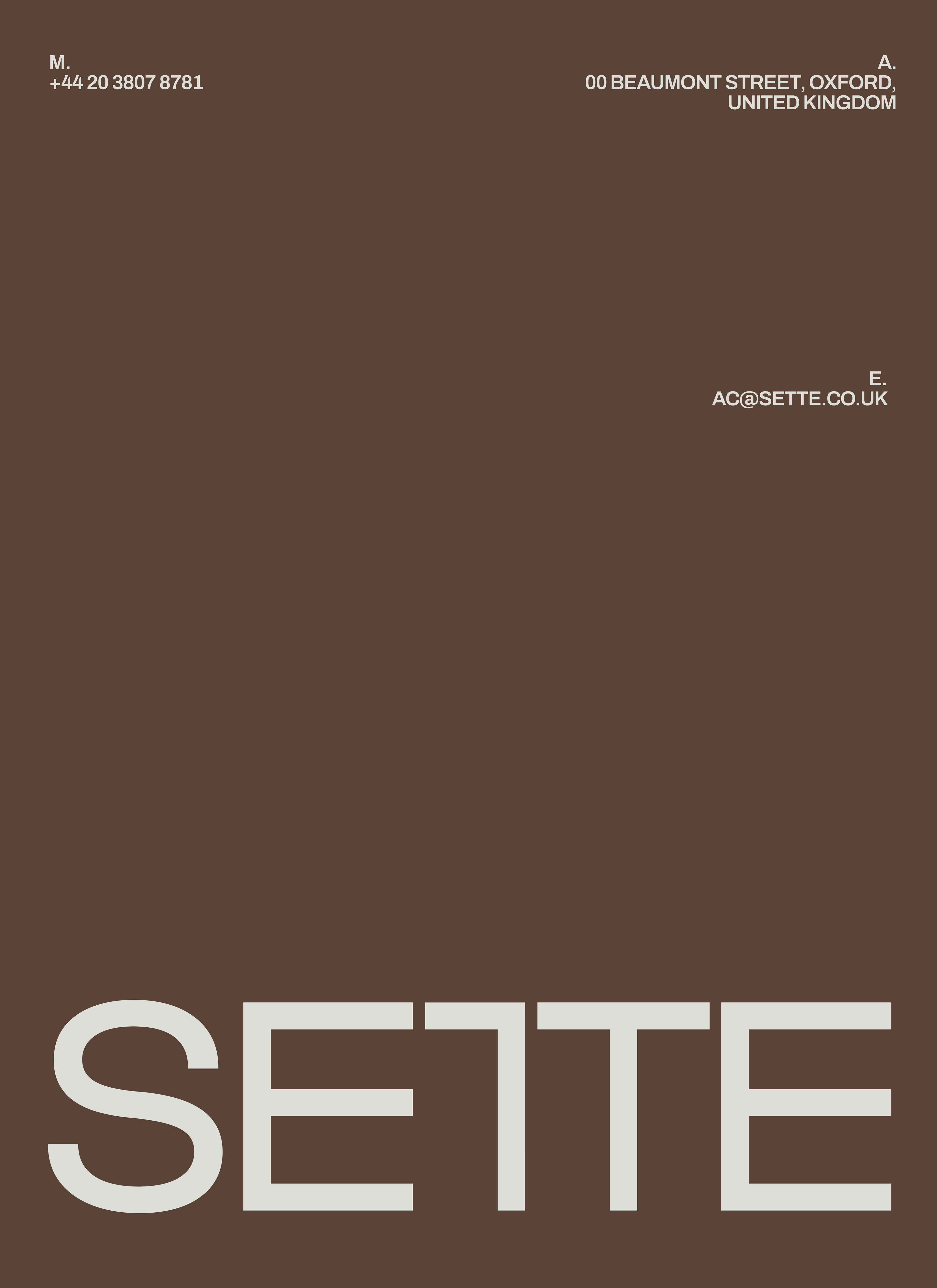
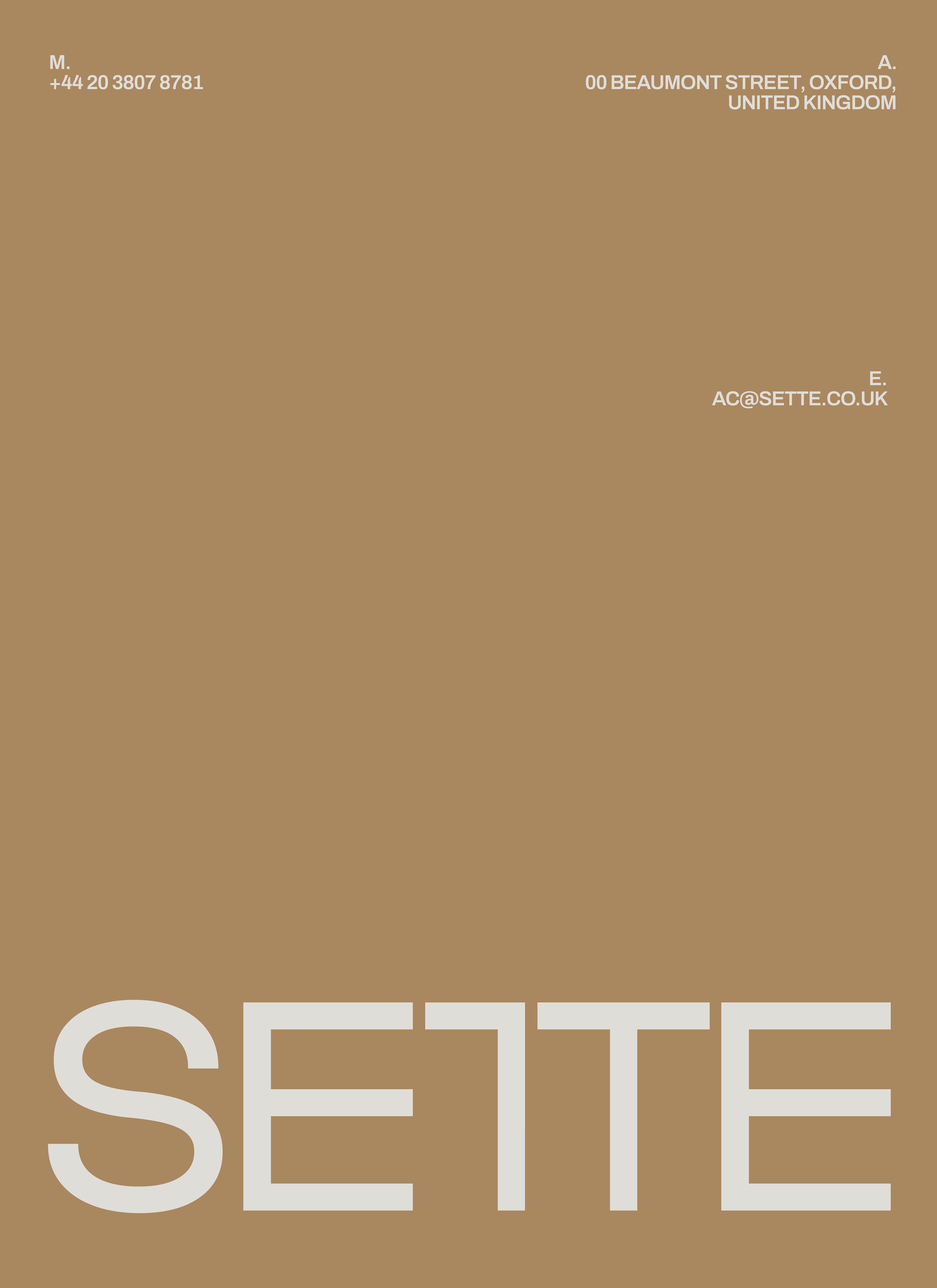
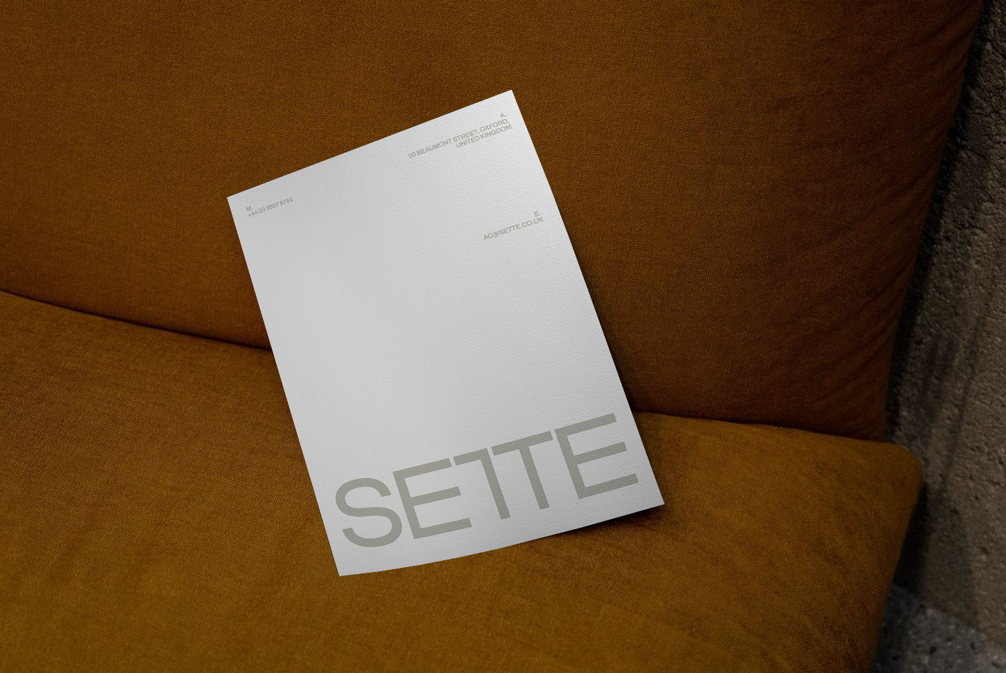
The clean lines and angular forms. We constructed a bold, geometric logomark that seamlessly merges the letterforms T and T. Repurposing the interlocking geometric shapes, we developed a set of graphic that can be assembled into endless configurations. These built structures are paired with a utilitarian but elegant typographic system and a minimal colour palette.
The identity stands out for its clean forms and striking graphic presence. A vibrant palette, creates tension and contrast against timeless neutrals like gray and black. Geometric repetitions bring structure and rhythm. The result is a modern, minimal language that feels both dynamic and sophisticated. Every detail was designed to bridge contemporary architecture with timeless design principles — transforming simplicity into a powerful visual statement.
Creative Direction: Marina Hauers & Paula Pedron
Visual Identity & Strategy: Marina Hauers
All Rights Reserved ©2025